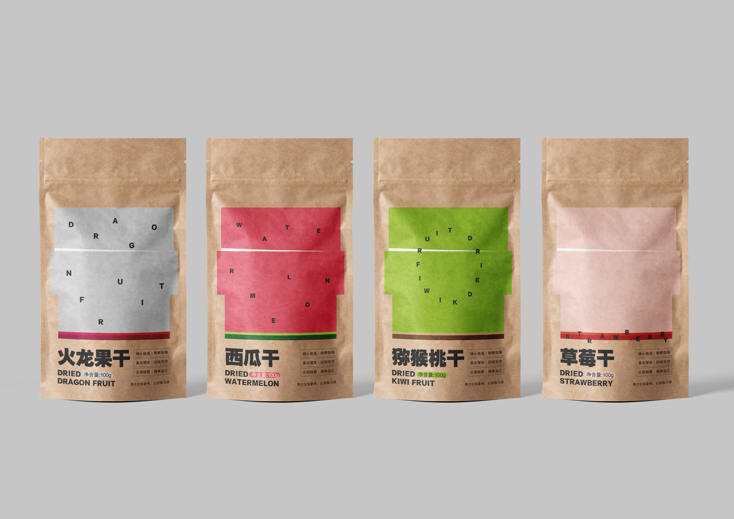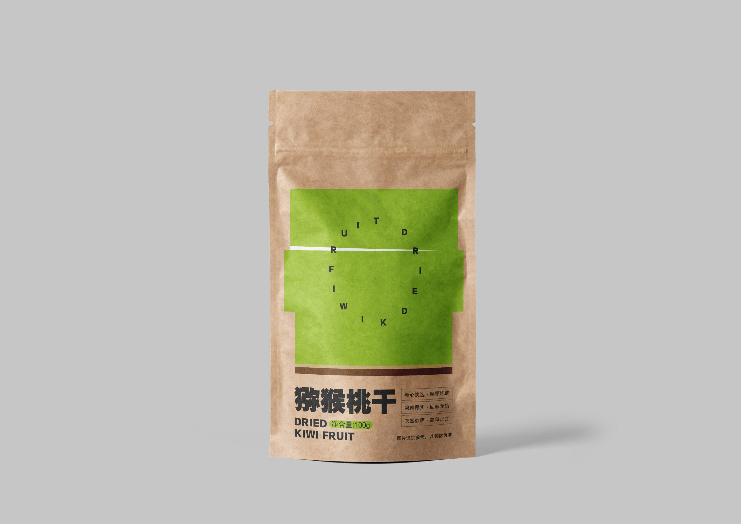

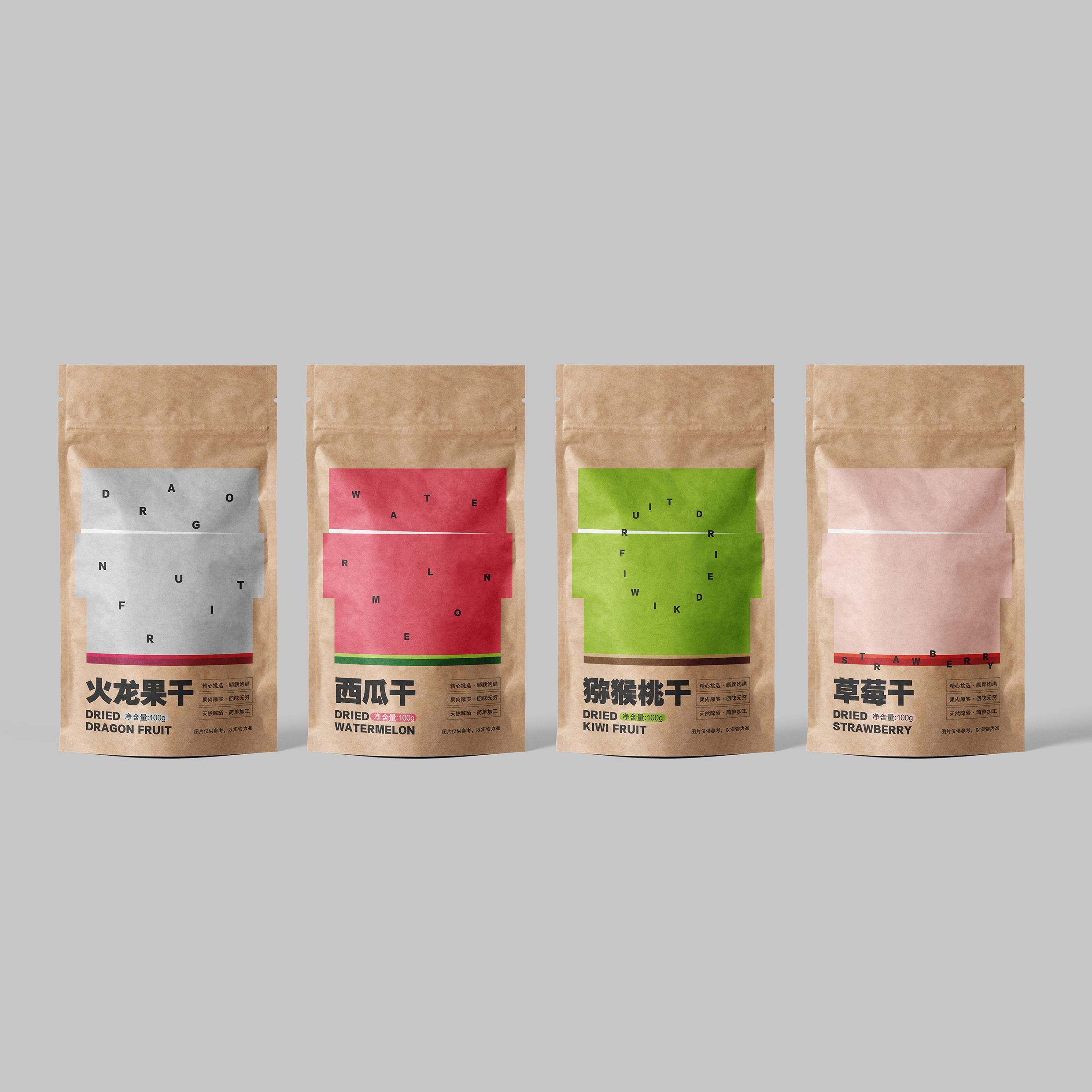
Packaging design for the dried fruit
Japan Graphic Design Association Special Award
Name of Winners:
Wei-Li Luo
Instructor:
None
Name of School:
South-Central Minzu University
Location of School:
China
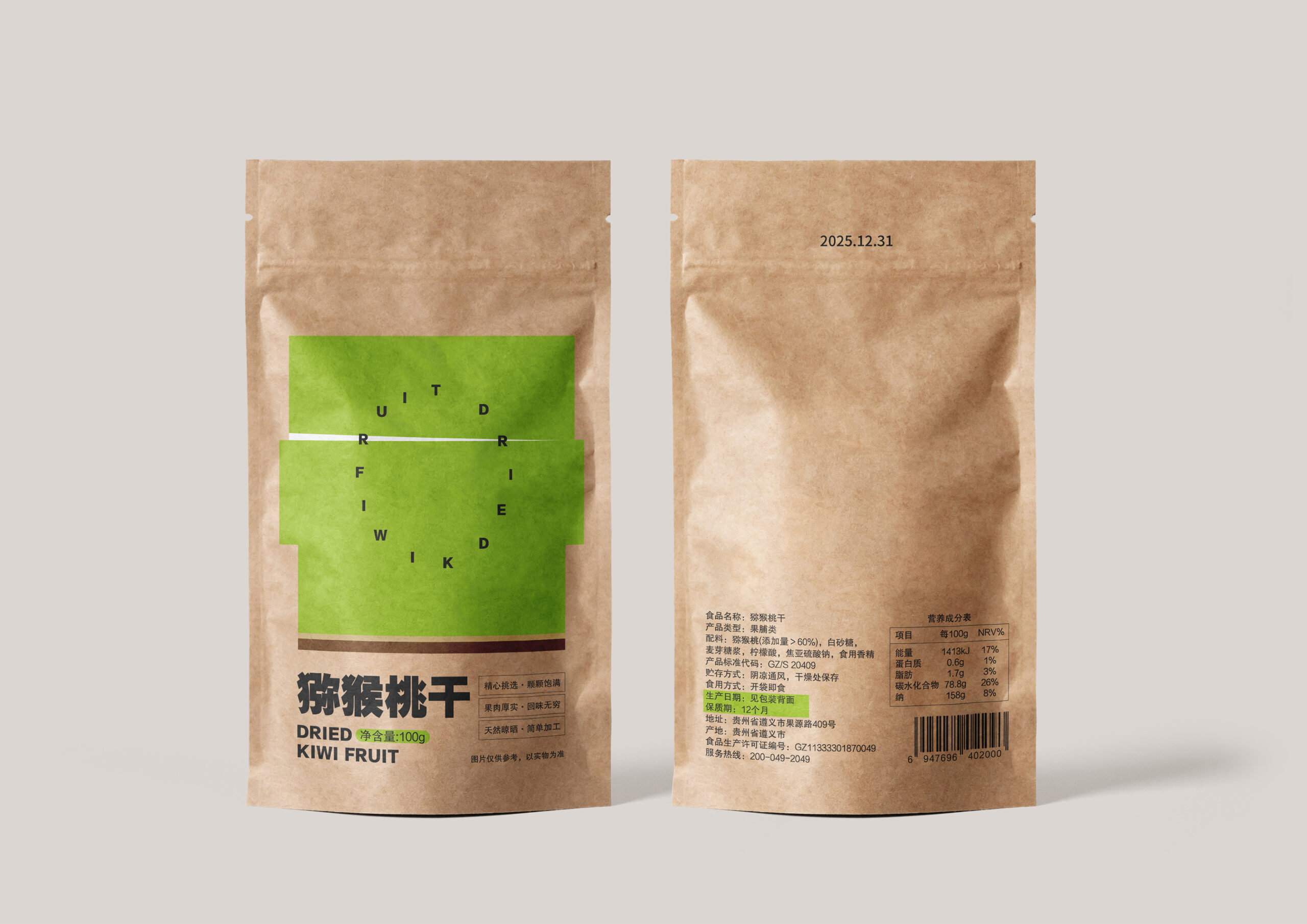
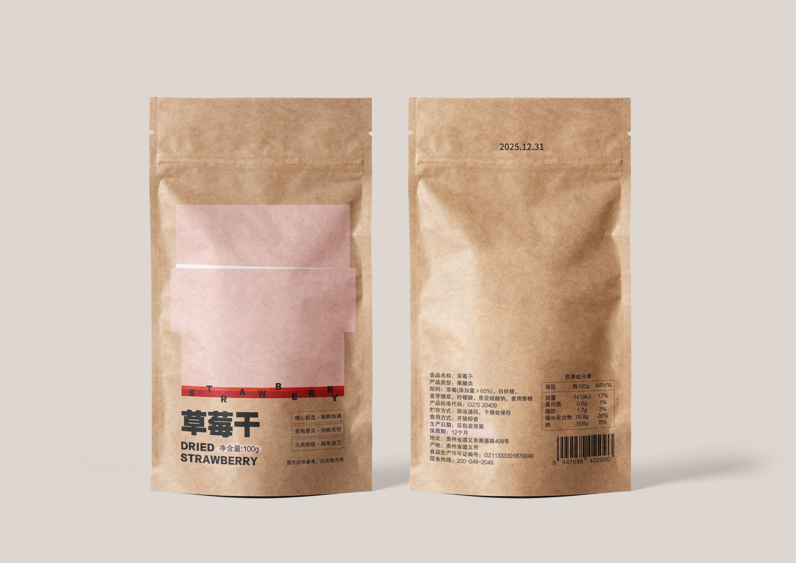
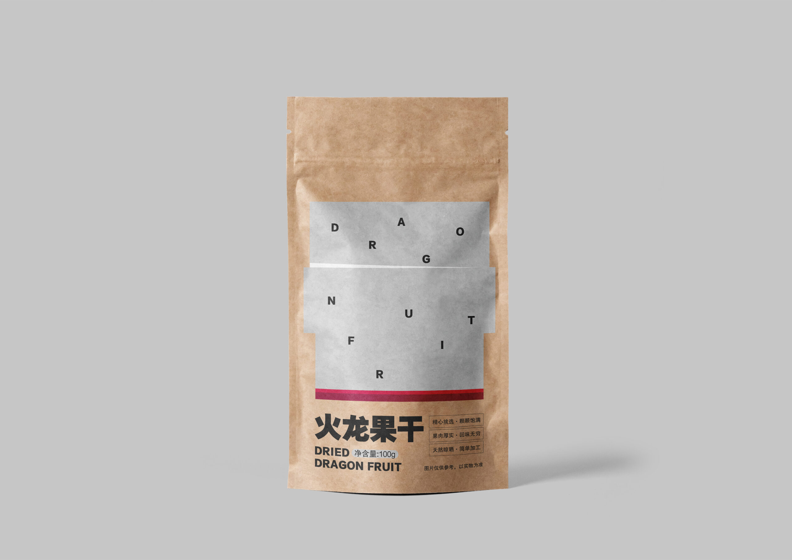
The work is a packaging design for the dried fruit. The main visual element is the Chinese character “干” and its text is graphicized. Then, according to the colors of the cut surfaces of kiwi, strawberry, dragon fruit and watermelon, the design is changed. In the graphics, the English serves as the element of seeds, making the packaging more interesting and also making the overall main visual element more biomimetic. Secondly, it is combined with the product text information to make it easier for the audience to identify. In addition, the packaging particularly emphasizes the production date and shelf life, allowing the audience to quickly obtain the key information and thus feel more at ease when making a purchase.